How I redesigned Gala Swap's core trading experience for both acquisition and retention, lifting activity ~18% and cutting new-visitor drop-off ~12%
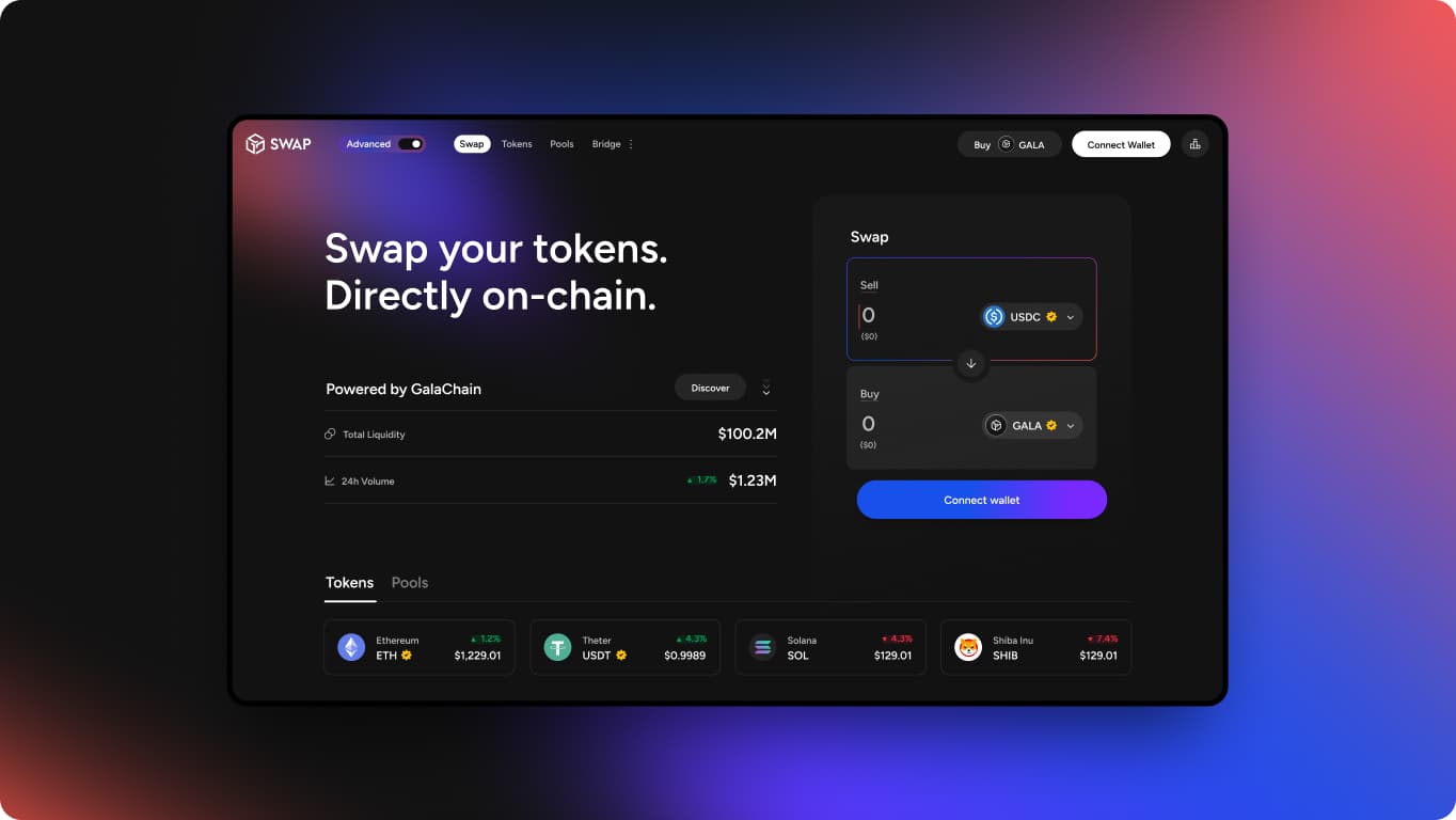
Gala Swap sits inside GalaChain's DeFi ecosystem, serving two very different audiences on one surface, retail traders new to DeFi and power users running bots, APIs, and liquidity strategies at volume. Trust was low against competitors and friction kept new traders from converting, while the platform needed retail acquisition to grow without alienating the power users generating its real trading volume. The core challenge was solving for acquisition and retention on the same surface, without one costing the other.
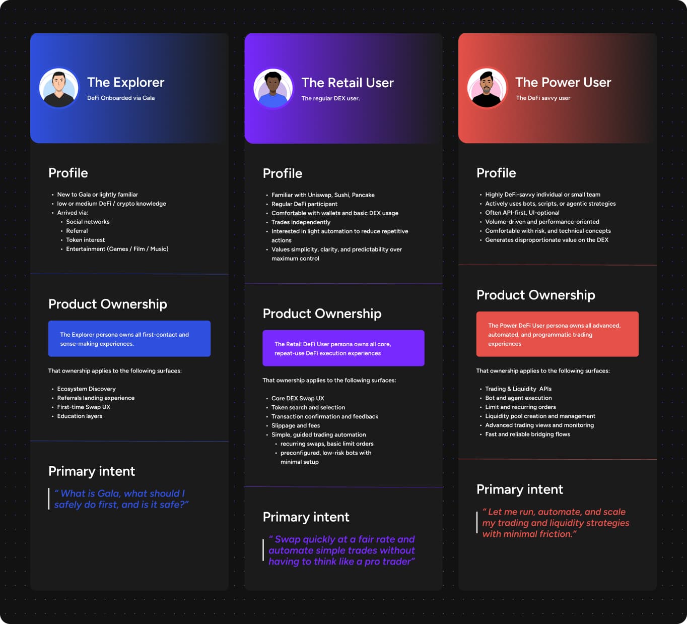
Gala's broader ecosystem needed seven personas mapped in total, spanning everything from token launches to infrastructure access, but Gala Swap itself centered on 3 types:
- •The Explorer, new or lightly familiar with Gala, arriving via social, referral, token interest, or entertainment. Owns first-contact and sense-making, discovery, first-time swap, education.
- •The Retail User, the regular DEX user, comfortable with wallets, trades independently, values simplicity and predictability over control. Owns core swap UX, token search, confirmations, light automation.
- •The Power User, highly DeFi-savvy, often API-first and UI-optional, running bots and agentic strategies. Owns advanced trading, liquidity pool management, automation, bridging.
For this optimisation objective, the Explorer and Retail User were my primary design focus, mapping directly to the acquisition and retention problem, while the Power User was mapped as a guardrail, protecting the trading volume already generated through liquidity provision and high frequency execution.
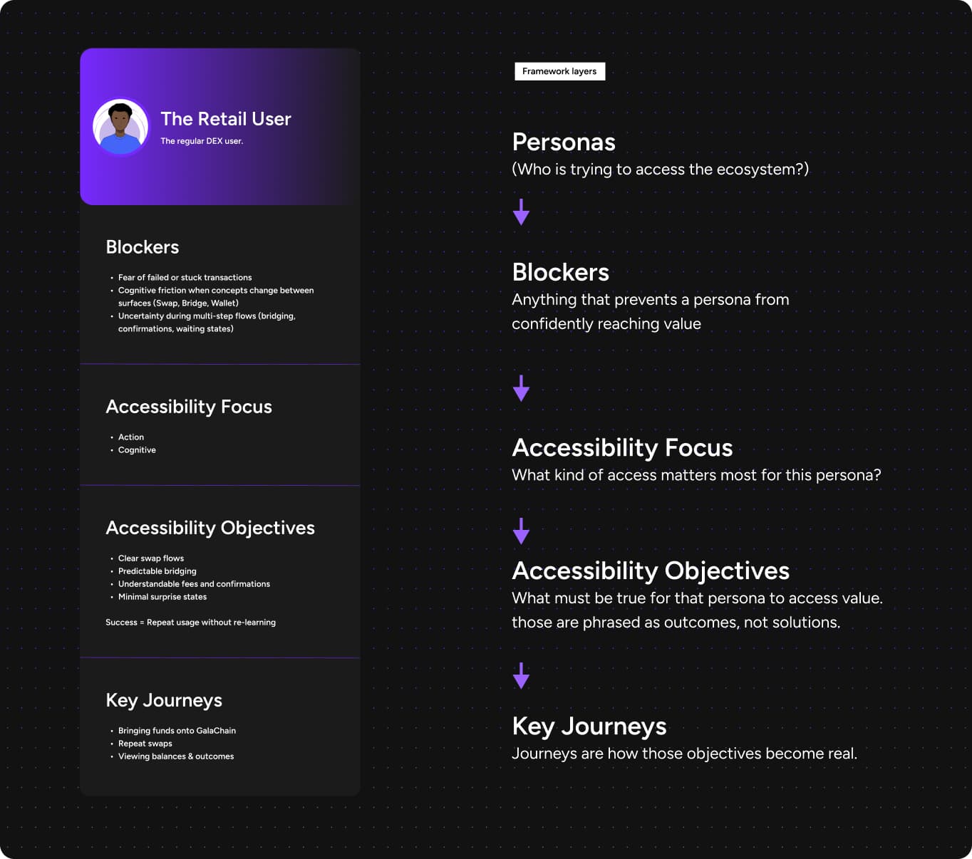
I defined accessibility at Gala as removing the right friction for each persona, not the same friction for everyone:
- 1.Cognitive, can I understand what's going on
- 2.Action, can I do the thing I came here to do
- 3.Technical, can I integrate, automate, or control this
- 4.Structural, can I navigate the ecosystem without getting lost
For instance, applied to the Retail User, the pipeline runs blockers through to key journeys, shown below. The Power User ran the same pipeline but landed on technical accessibility instead, proof the two personas weren't opposites, just different outputs of the same process.
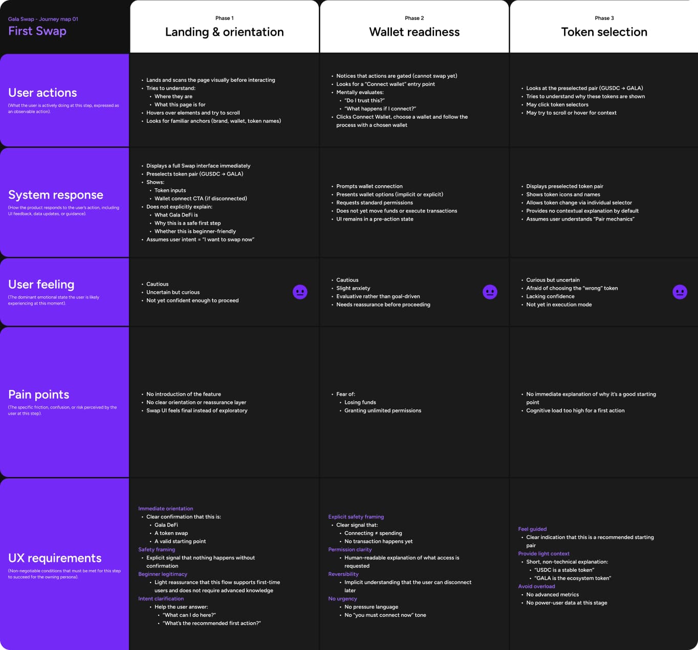
Every journey I mapped followed the same structure, user actions, system response, user feeling, pain points, UX requirements, and a success signal, phase by phase across the funnel.
I ran an AI agent over the existing flow as part of this research, walking it through the live product the way a real user would, and it consistently surfaced friction points worth digging into further. The setup itself was simple, a markdown brief inside Claude Code defining the persona and task, then a custom Playwright script the agent wrote and ran to actually navigate the live product, clicking and typing through the flow rather than me describing it secondhand.
The first journey I mapped at this depth was First Swap. The trader's first real interaction with the platform, and the moment that decided whether trust was built. Then followed funding and bridging, repeat trades, automation discovery, and portfolio management. But First Swap is where the acquisition and retention work concentrated.
The 6 phases mapped for a retail user's first swap:
- •Landing and orientation
- •Wallet readiness
- •Token selection
- •Amount entry and preview
- •Confirmation
- •Transaction states and transition
Acquisition, and retention were the primary focus, making the experience trustworthy and seamless enough that new traders actually converted and kept coming back. One principle ran across every surface, a non-connected state built for orientation and trust, a connected state built for execution and depth, so a visitor always knew whether they were still looking around or already managing funds. The non-connected state of the landing page was redesigned for orientation and trust. I integrated signals like liquidity, volume, and verified token indicators into the non-connected view specifically because that's where a new visitor is still deciding whether to trust the platform at all. The decision here was to also unlock the ability to simulate trades and see the advantageous fees Gala could offer, before ever connecting a wallet.
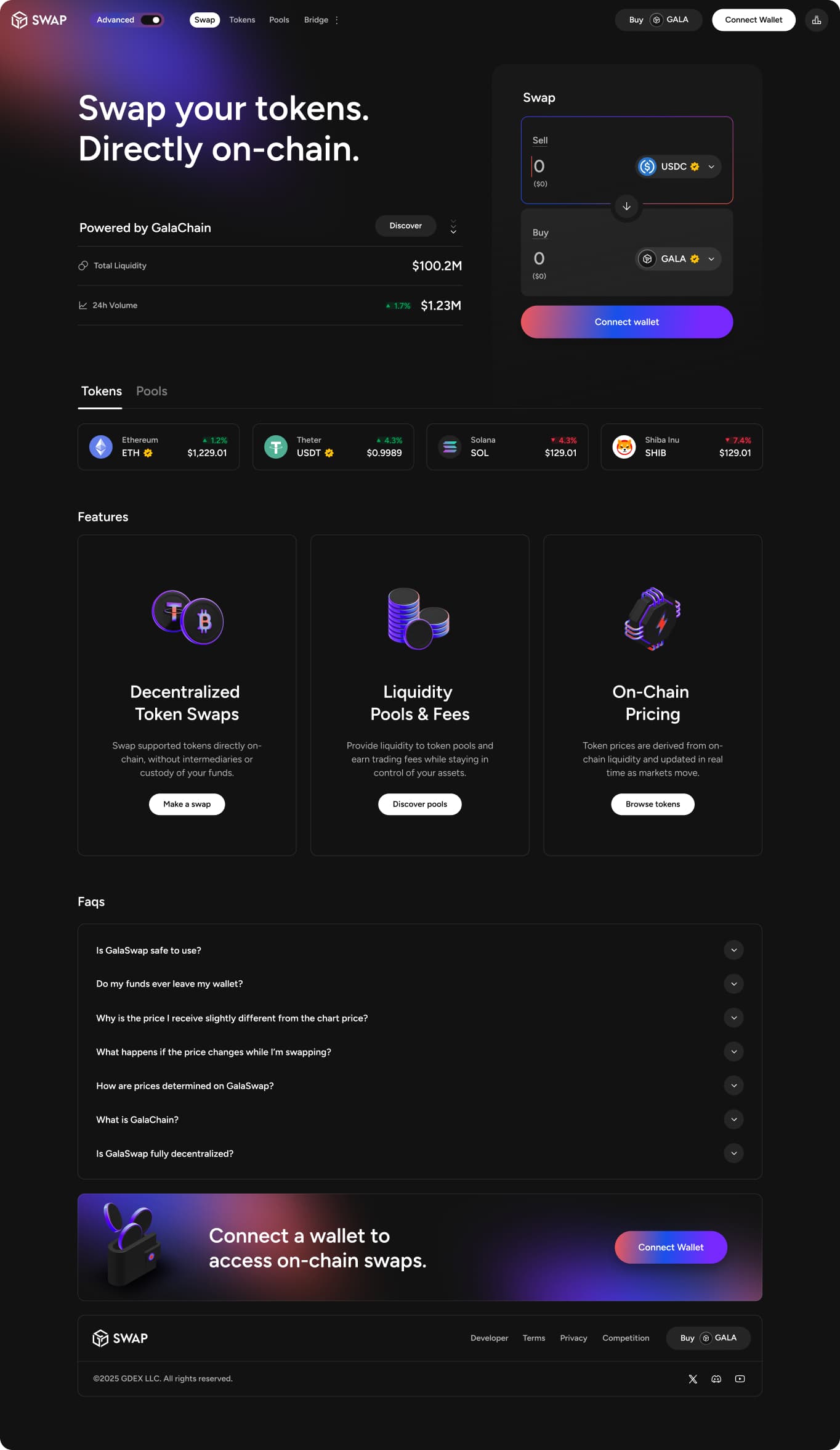
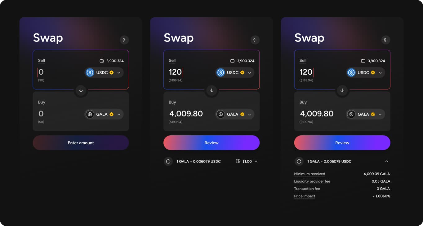
A new trader's first swap was the highest-stakes moment in the whole experience, research showed users landing cautious and uncertain, scanning for anchors before they'd trust anything enough to interact. I designed around themes that came directly out of the journey mapped in Discovery: Progressive disclosure within the swap card itself, the CTA stays disabled until a valid amount is entered, a distinct review state appears before anything executes, and an expandable breakdown surfaces minimum received, liquidity provider fee, transaction fee, and price impact, one tap away rather than upfront. A new trader sees exactly what they're agreeing to before committing, without the card overwhelming them with every number at once.
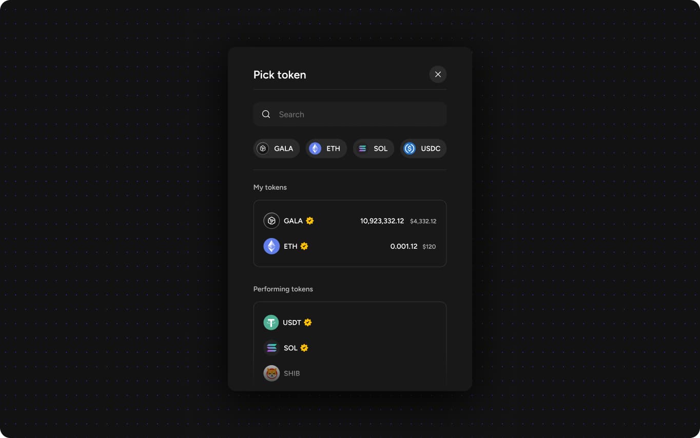
Guided token selection over blank choice, a search-first modal that leads with the tokens already in the connected wallet, balances and dollar value shown alongside verified badges, then surfaces the platform's most active tokens, so a new trader wasn't starting from an empty search needing to already know what to look for.
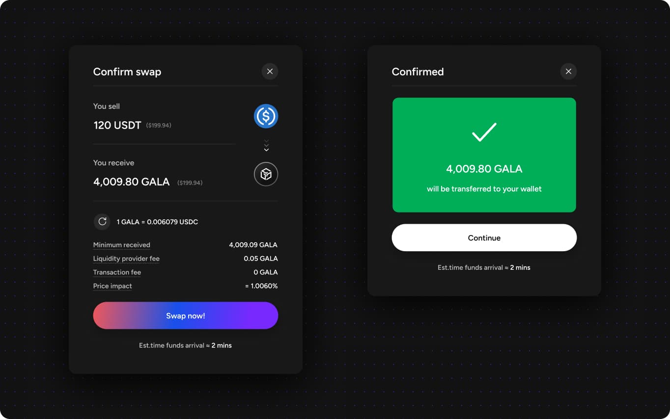
Transparent costs, clarifying fee versus price impact, and explaining that prices can move before final confirmation, so a changing number read as normal, not alarming.
A legible completion state with a visible distinction between the review step and the action that actually executes the swap. "Review & Confirm" was reading as final and creating fear of an irreversible mistake, followed by a persistent success card, not a toast that vanishes, that states the estimated arrival time explicitly rather than implying funds land instantly.
Trust earned at first swap doesn't survive contact with a confusing surface right after it. Once a trader crossed that first stage, the next place they'd naturally look at was providing or exploring liquidity, in my opinion, this was still one of the most intimidating parts of the old platform.
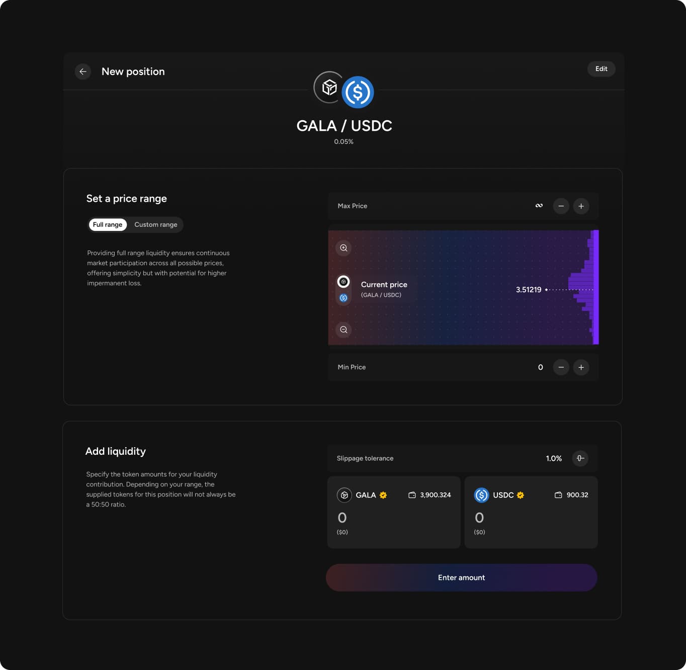
Liquidity pool settings were dense, technical, and easy to misread, which kept retail and explorer traders from ever engaging with them, even as an option worth exploring. This was a cognitive accessibility gap in the same terms the framework defined, users couldn't tell whether a position was healthy or losing money at a glance. I redesigned three connected surfaces to fix it. A new position flow replaces raw parameter inputs with a full range versus custom range choice, explained in plain language directly in the flow, full range means simpler setup at the cost of higher impermanent loss, rather than hiding that tradeoff behind jargon. Custom range goes further, replacing raw price bounds with named presets, Wide, Stable, Upper side, Lower side, each with a plain-language description (Stable, for instance, reads simply as good for low volatility pairs).
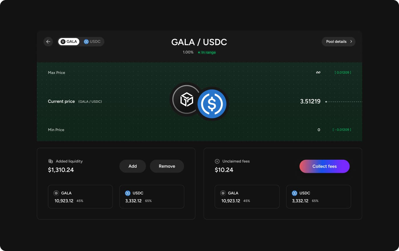
A position detail view shows added liquidity, unclaimed fees, and range status visually, a green band when a position is earning, so a retail trader could read pool health without needing power-user fluency.
A positions list shows every pool at a glance, in range or out of range stated plainly and color-coded, current price and value visible without opening anything.
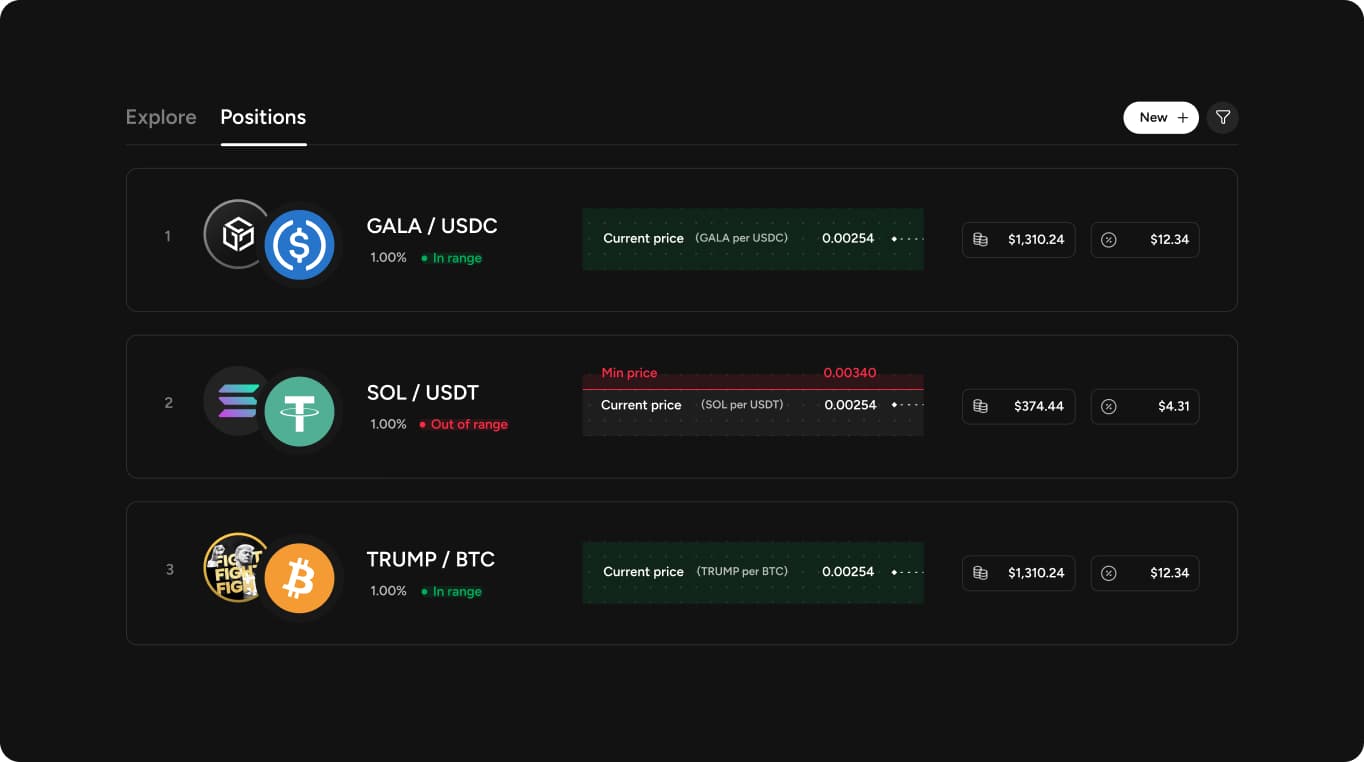
This mattered for retention specifically, a trader who trusted their first swap enough to keep exploring needed the next surface to feel just as legible, not a step back into unexplained DeFi jargon.
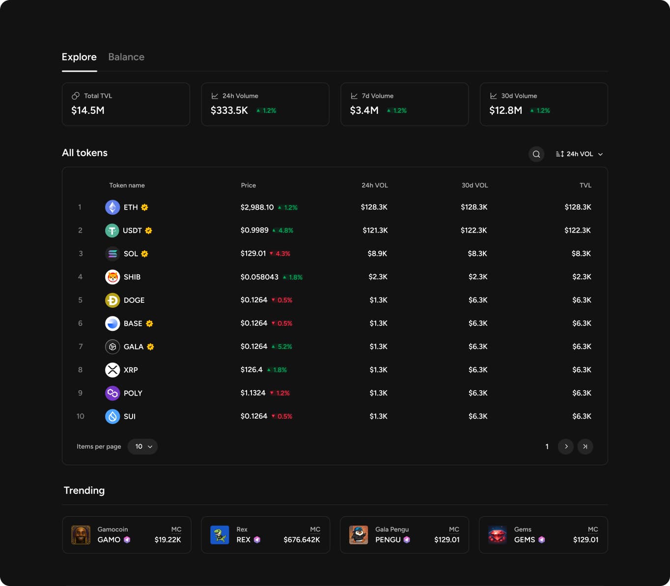
Legible pools solved trust for the surface a trader was already looking at. The next question was why they'd open the app at all on a day they weren't planning to trade. I added a dedicated Explore view with platform stats and a Trending section, so a trader could actually navigate the ecosystem instead of relying on search alone, closing the structural accessibility gap the framework named. A returning trader now had an actual reason to open the app beyond repeating a single swap, discovery as its own retention lever, not just usability polish.
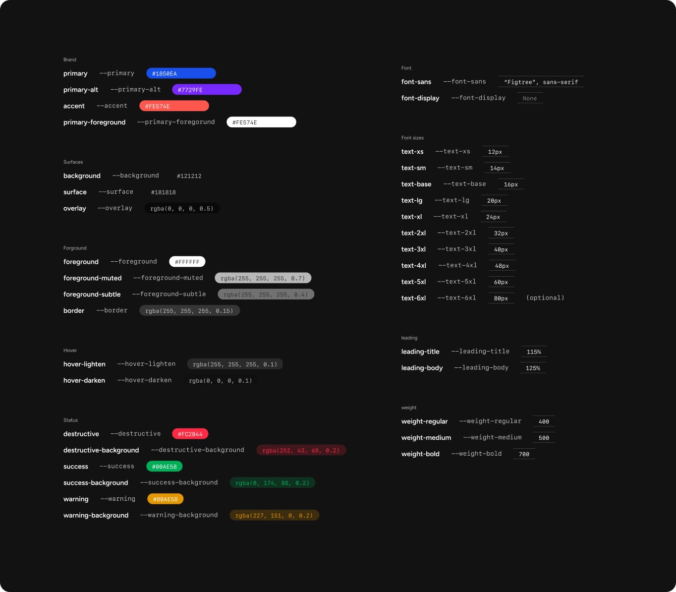
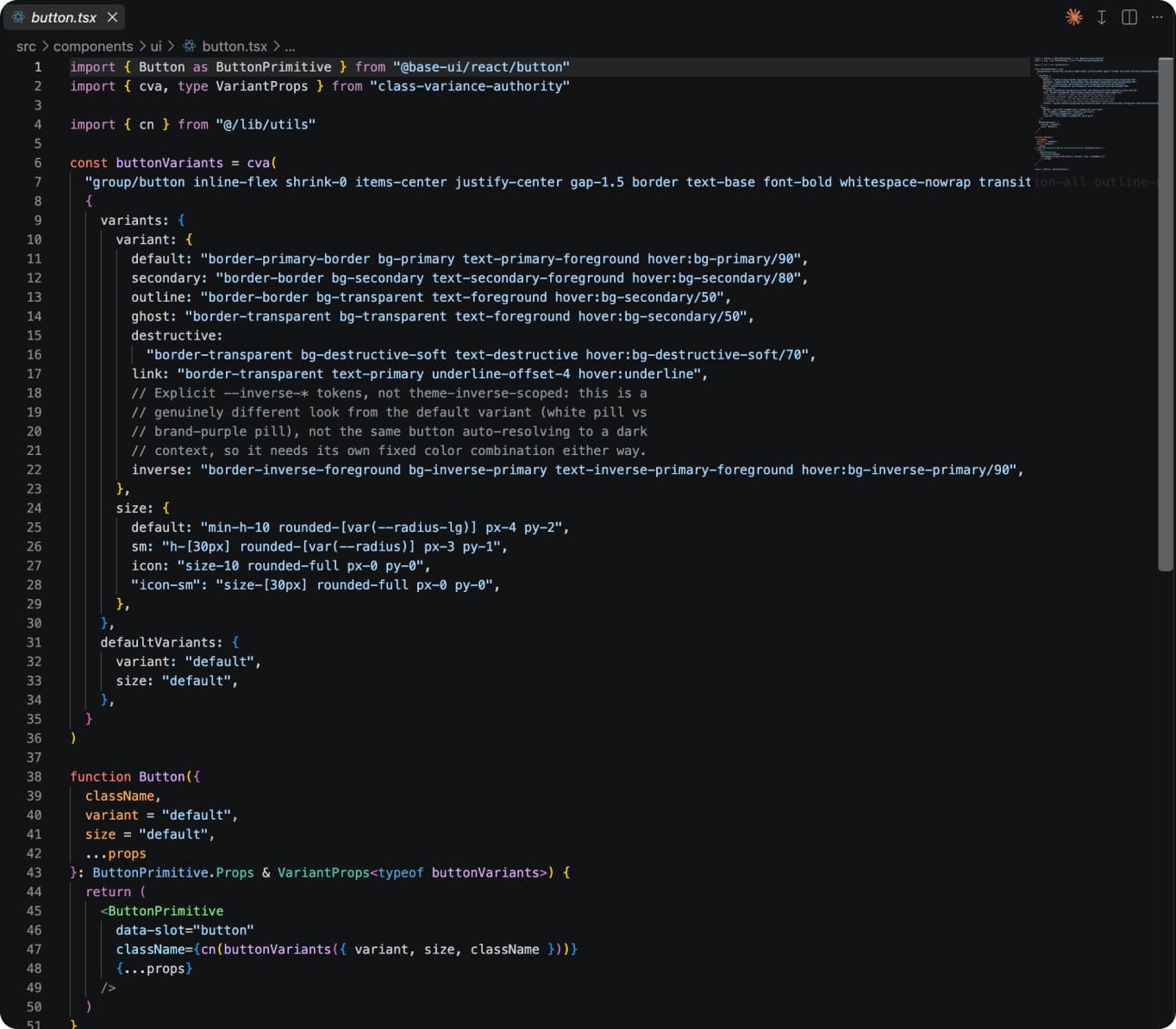
Every value was tokenized, primary, surface, destructive, success, warning, rather than raw hex or pixel values referenced directly in components. That naming is what made AI-assisted generation reliable inside Cursor, referencing intent rather than guessing at "the right blue" each time, and gave me both guardrails, on-brand and accessible by construction, and speed, new screens assembled from existing primitives across First Swap, liquidity pools, and token discovery in parallel. I delivered a complete front end shell, partly connected to live data, built in real code against the company's existing repo. Then handed over to the backend team to connect the remaining data structure. That meant the design system itself doubled as the implementation, the same tokens and components a hiring engineer would actually work with, not a separate reference document that drifted from what shipped.
The team measured this through a before/after comparison of event-level data, each window normalized to comparable entry volume. Directional, not a controlled experiment, no control group or randomization, but consistent enough to read as a real signal. Beyond the numbers, the Discord community's response was positive and specific, people noticed the interface felt more trustworthy and easier to navigate, directly answering the trust problem the redesign set out to solve.
The framework was the actual unlock here. Naming Explorer and Retail trust as the explicit priority, with power user protection as a clear, checkable guardrail rather than an equal second brief, meant every decision had a clear job to do and a clear way to check if it worked.