How I led Papercup's product design from pre-seed to a $20M Series A, adapting the product when a shift in business strategy required scaling
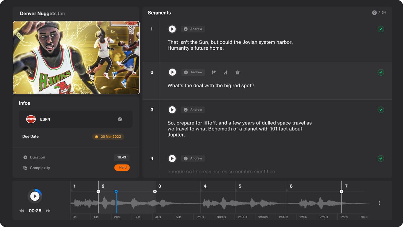
Papercup was founded with a vision to make videos watchable in any language, letting content creators, from YouTubers to Netflix producers, reach an international audience from the same source asset. The team had assembled ML and dev engineers to build the underlying speech processing architecture, but the system's successive processing style meant errors compounded, a transcript glitch carried straight through to the final speech, and there was no interface, no user base, and no competitor to benchmark against when I joined. I concluded early that quality couldn't come from the model alone, it had to come from a human in the loop, my objective was to design a system that let users work alongside the technology to lift output quality where the model fell short.
The engineers' initial system was a mix of Machine Learning models and APIs to generate video translations by applying a human-sounding voiceover to the original source. The process was mainly automated and split into three areas: The Audio Signal Recognition (ASR) generates a segmented transcript from the source audio. The accuracy was not perfect and was dependent on the source quality. The Machine Translation (MT) translates the source text into the target language. The results were generic, similar to Google Translate, and did not reflect the speaker's speech tone. The Text-to-Speech (TTS) module, Papercup's in-house "secret sauce," converts the translated script into a human-sounding voice. The goal was to mimic the original speaker's tone and style.
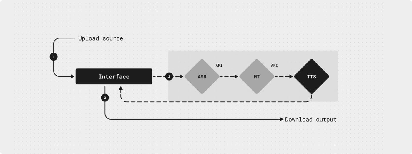
While the system produced decent results on some videos, its successive processing style led to mistakes in most cases, glitches in the source transcript carried all the way through to the final translated speech. It was clear that improving quality meant getting humans involved in the process.
Being in the founding stage meant I had no product history and no user data. Not even a competitor to benchmark against. My priority was understanding exactly who'd use the software, since the product had to be built around their specific needs, not assumptions:
- •Customer (Creator), semi-professional channel owners building an audience on YouTube
- •QA (Quality Assurance), native speakers working as freelance translation professionals
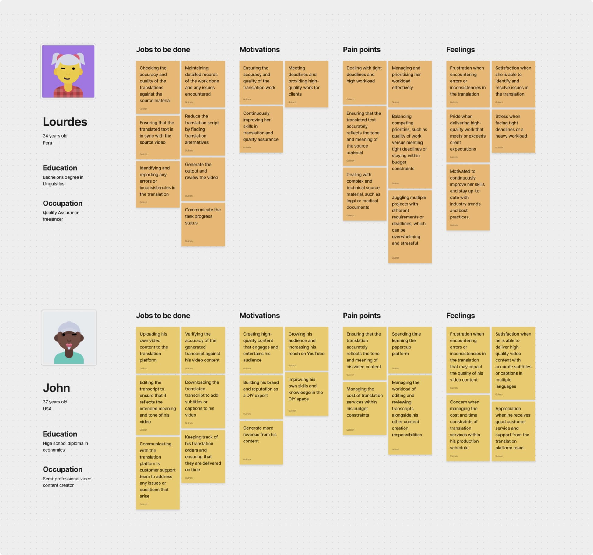
My early hypothesis was to involve customers directly in the workflow, having them handle transcription using their own knowledge of the source. I tested a transcription prototype the team had built for weeks, scheduling in-person interviews with video creators and trying to onboard them into the pipeline. It didn't hold, the friction of learning a new tool was too high, customers weren't willing to pay for or learn additional editing software they hadn't asked for. I made the call to redirect the entire research focus toward QAs, freelancers hired by Papercup. That decision unlocked a constant stream of usable feedback that let me iterate the experience continuously, and it shaped the direction of the product for the next two years.
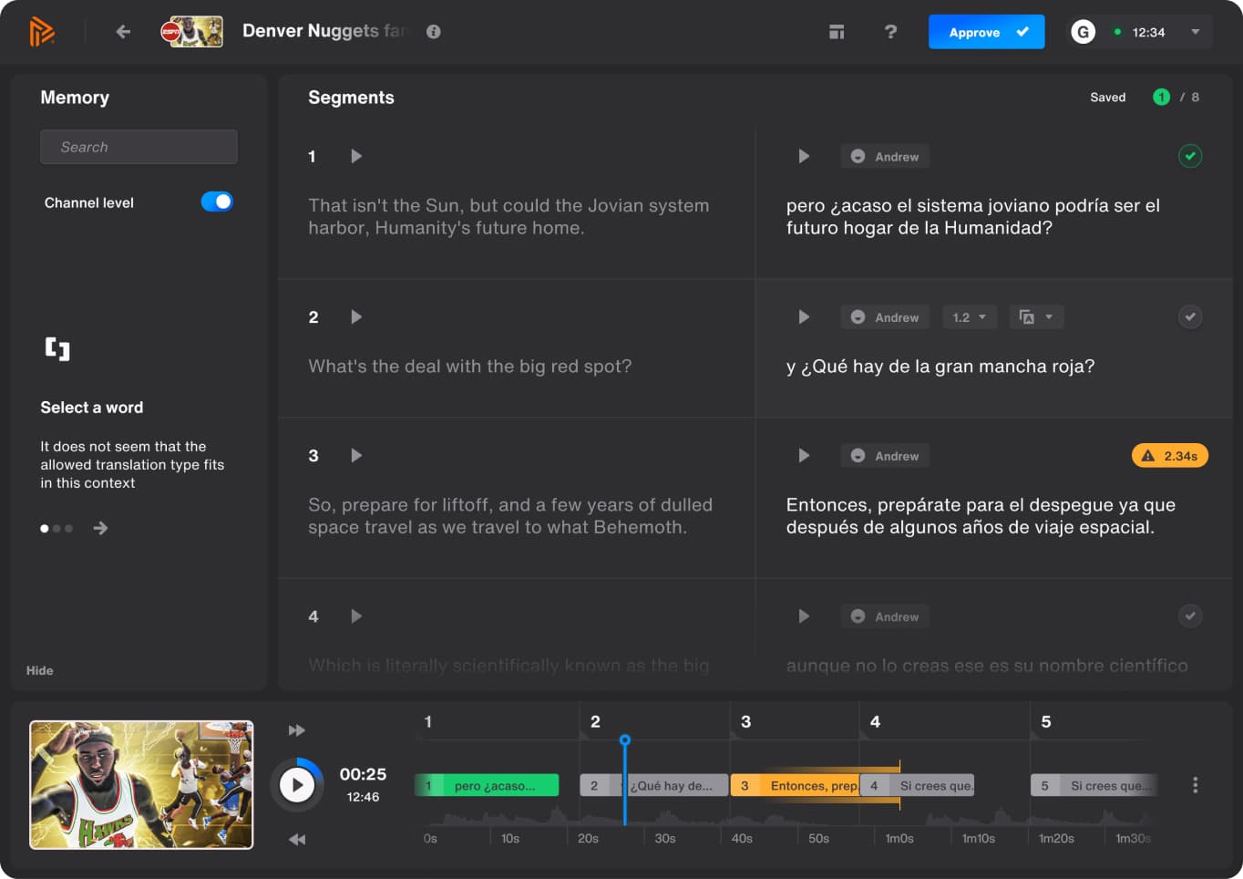
After months of prototyping and testing, I designed the first generation of the in house translation software, working closely with engineers to ship it. I named it Studio. QAs used it to:
- •Verify source transcript accuracy and translation quality
- •Listen to audio to confirm correct pronunciation and emotion
- •Check timing of translated sentences against the original video
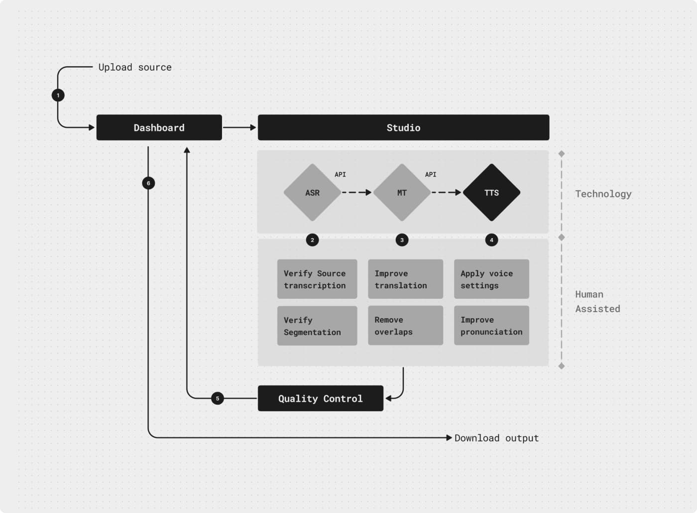
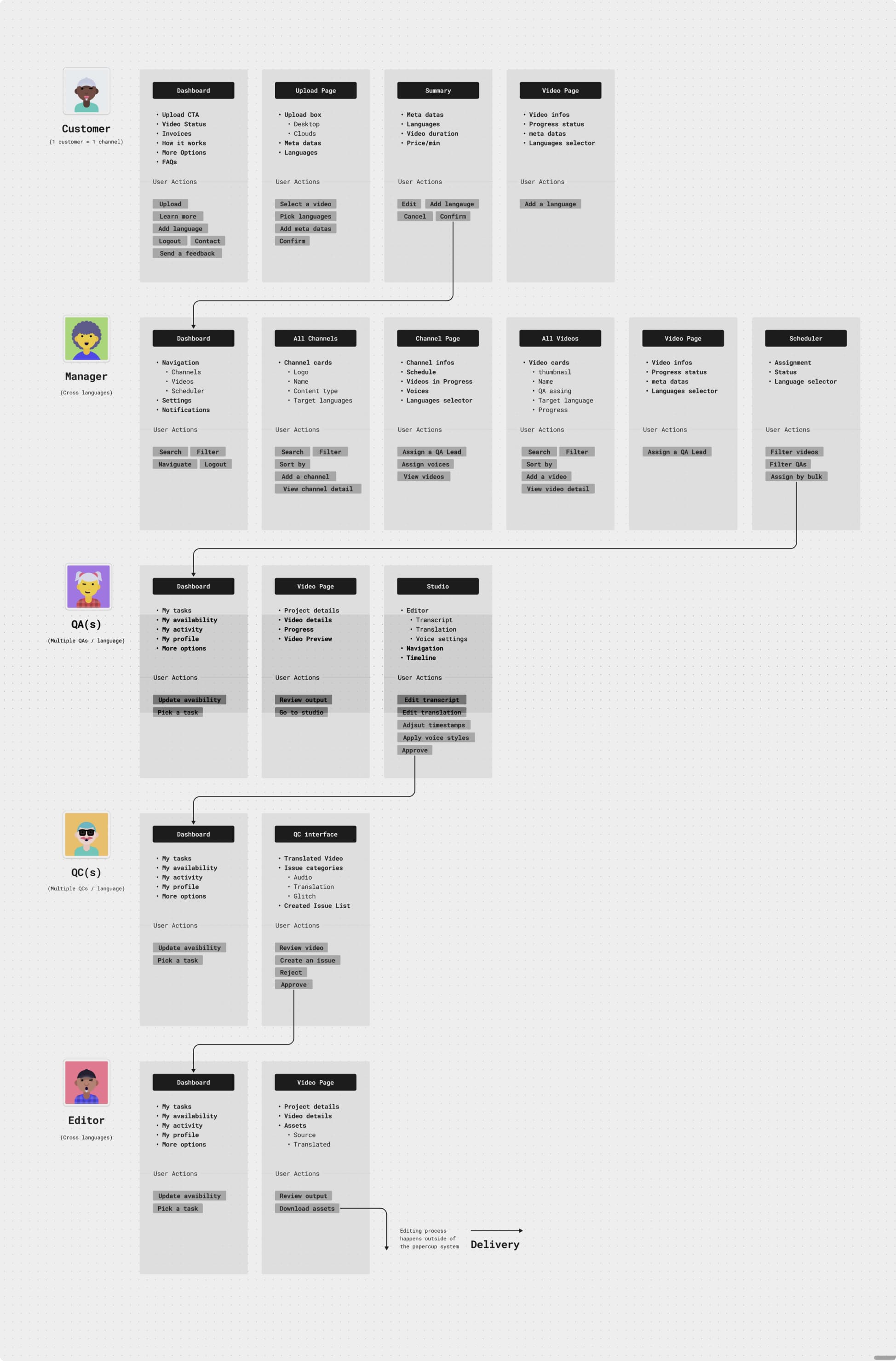
As Papercup moved into higher value customer tiers, demand increased, and both quality and pace needed to scale to keep up. That pushed the product to mature quickly, QA responsibilities grew beyond translation review alone, and I kept leading the design evolution for the new roles that came with it, management, quality control, video editing, breaking the pipeline down into specialised roles rather than asking QAs to cover everything, so throughput and translation quality could increase together:
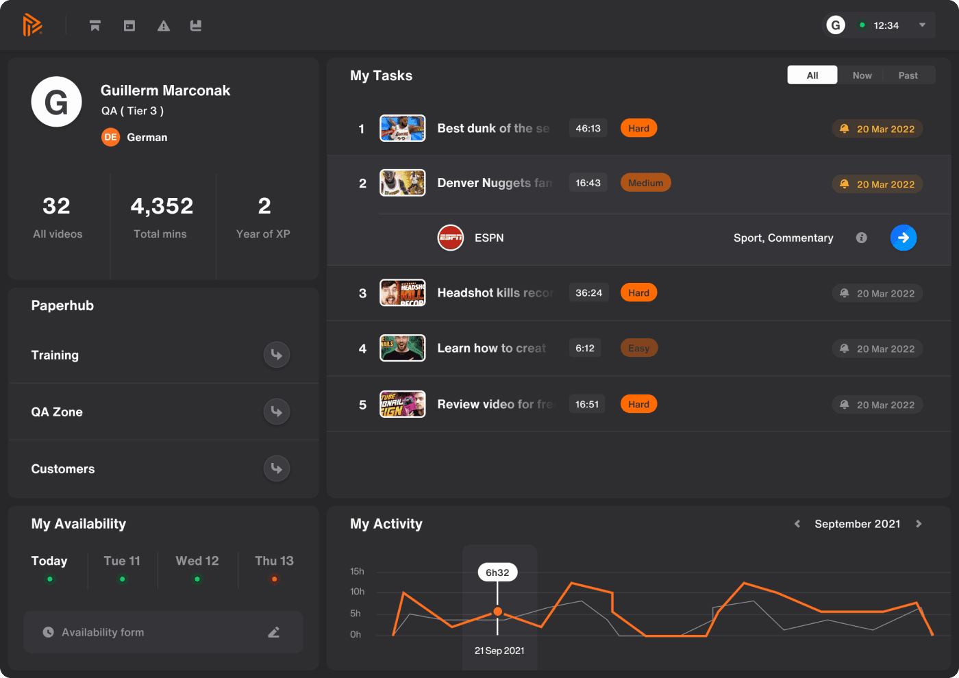
The dashboard lets freelancers follow up on assigned tasks and manage their personal settings, availability, activity, progression, and more. Users: QA, QC.
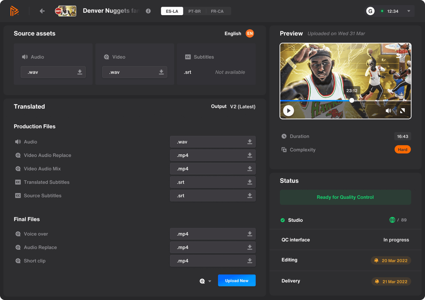
The video page manages every single video asset in the system, from the source customer files to the translated ones, everything lives here. Users, Editor, QA Manager.
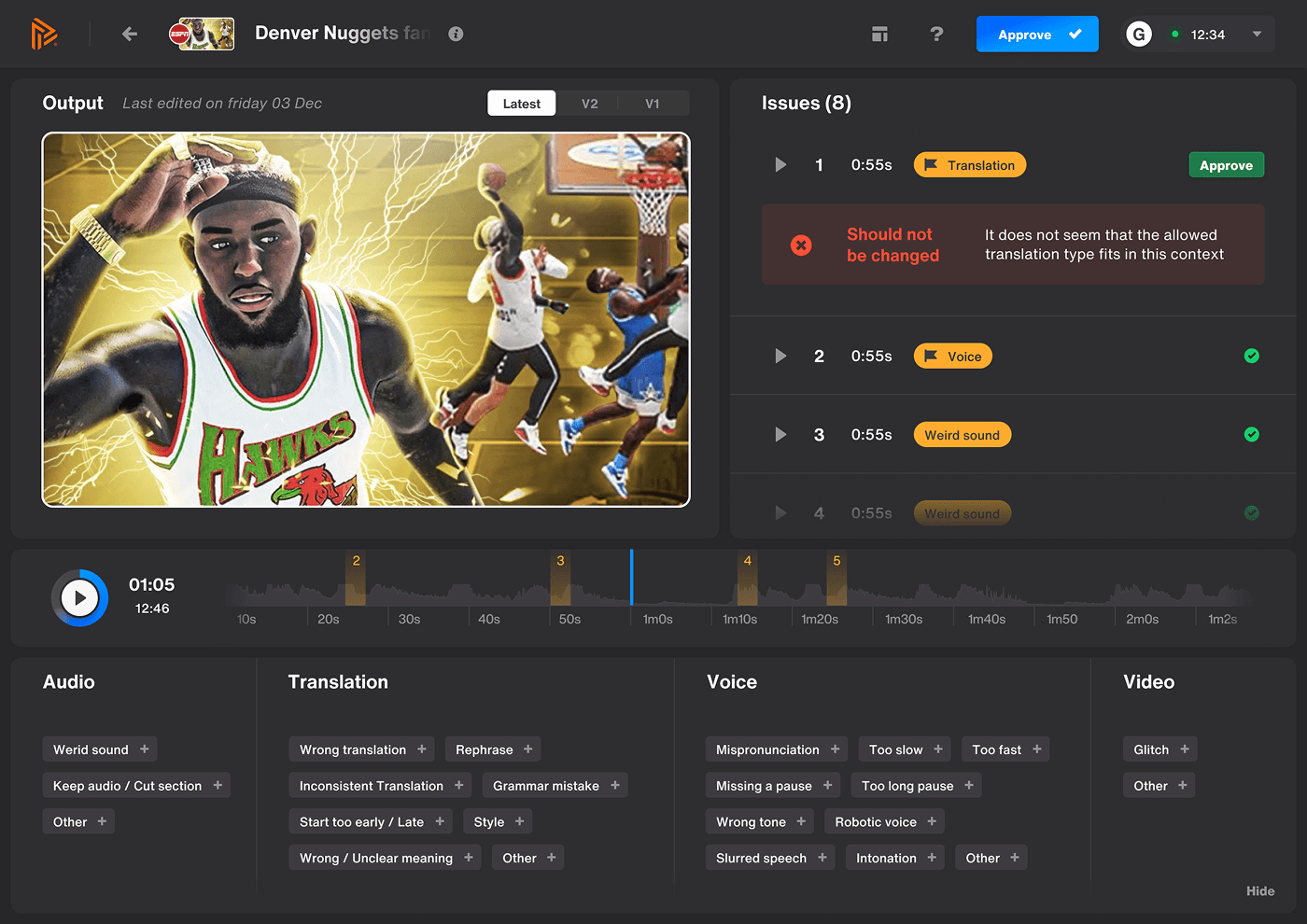
The QC interface is used to review translated outputs generated by QAs, flagging categorised issue presets on the fly and writing feedback or specifications. Users, QC.
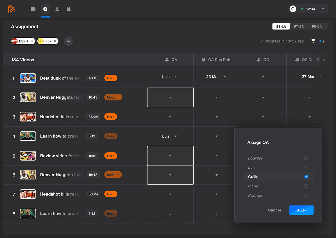
The scheduler lets managers assign tasks to QAs and QCs in bulk, filterable by customer, freelancer availability, video status, and more. Users, Account Manager.
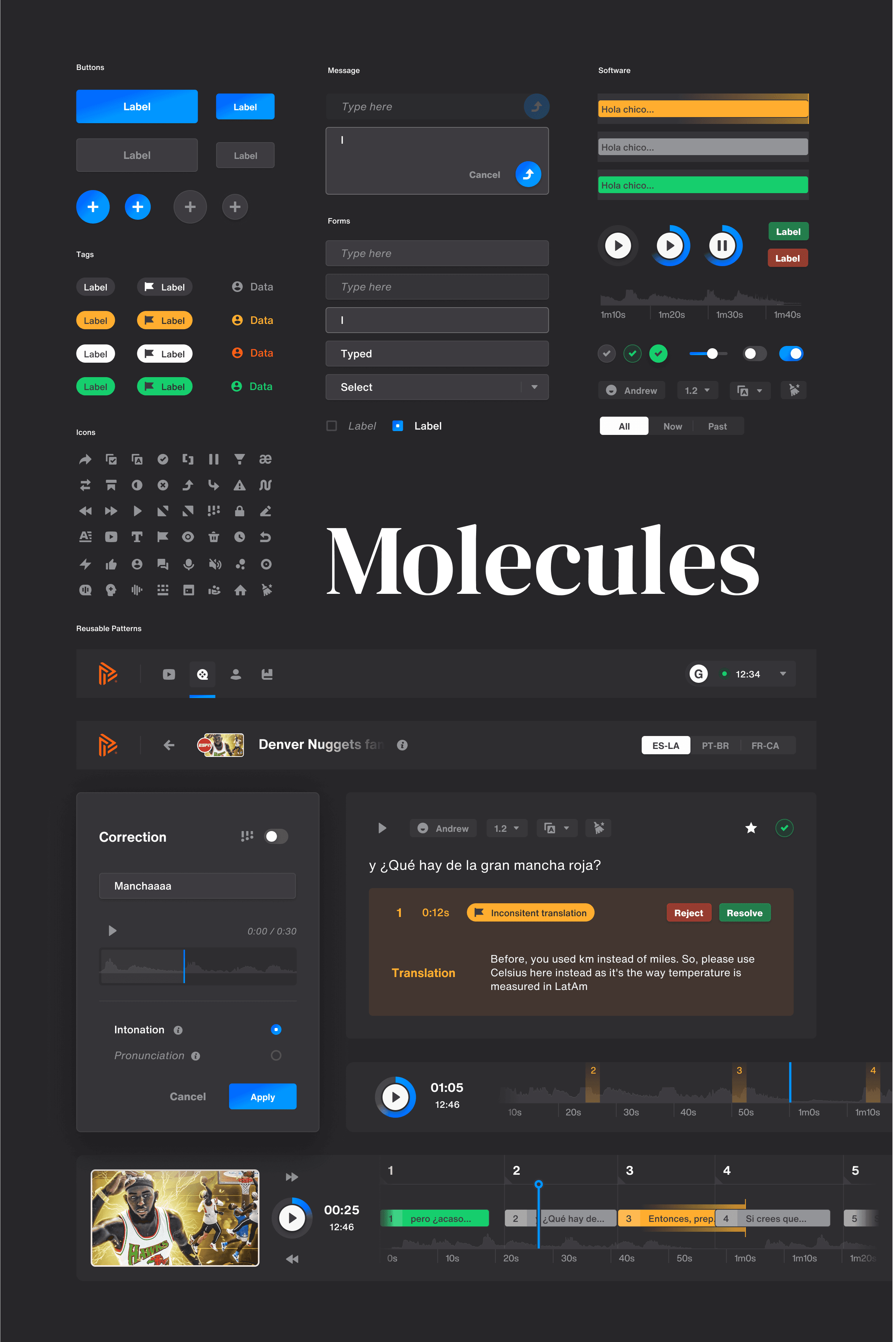
Building the full design system was what made shipping four distinct interfaces consistently without the ecosystem fragmenting, every new screen inherited the same components and interaction patterns by default, so QAs, QCs, managers, and editors experienced one coherent product instead of four tools that happened to share a login.
2 years in and the shift toward media companies and enterprises accelerated, pushing delivery frequency and quality expectations even higher. Even though the entire pipeline ecosystem was allowing for smooth account management, the part still doing the heavy lifting was the translation tool itself. It was the heaviest bottleneck, needing an average 3:1 ratio of processing time to video duration. Tackling that metric became my obsession, but after years of stacking features into a single interface, even I struggled to identify what was actually slowing it down.
How do you simplify a complex, multi tasking interface, improve QA workflow efficiency, and meet the quality bar professional industries expect, all at once? My answer was splitting the interface into separate modules, each with a specific function, reducing complexity and enabling more structured data capture. Clearer guidance through the workflow would let QAs move faster on routine work and spend more time on the decisions that actually mattered.
2 years designing the product meant I'd also built up my own assumptions about user behaviour. I set those aside and restarted research from zero, re-interviewing QAs myself, remapping the journey, and identifying which features needed isolating into their own steps. It surfaced pain points the version I'd built had accumulated without me noticing.
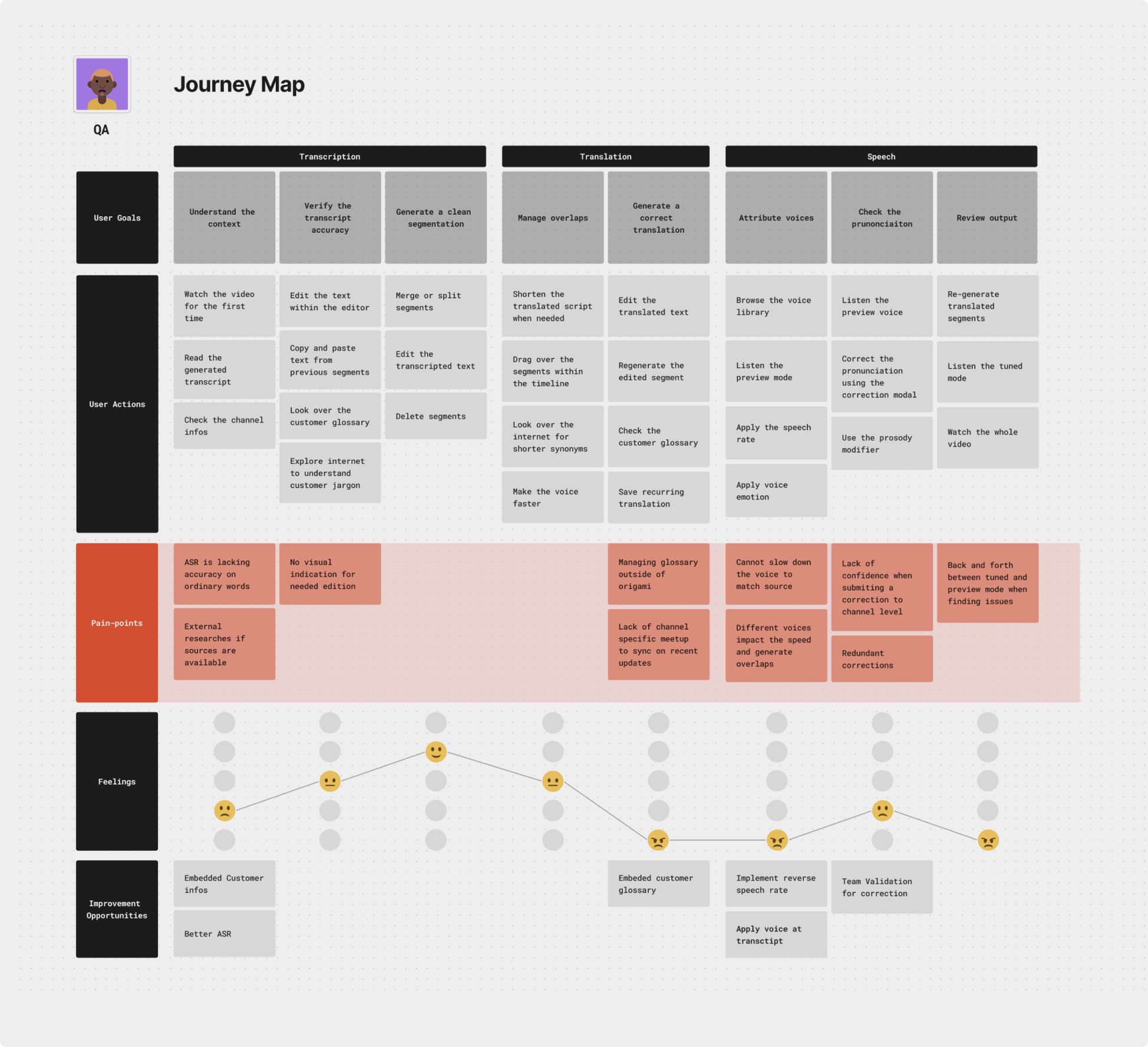
The plan, split the workflow into three distinct interfaces, Transcript, Translation, Speech. I iterated with users until translation quality held up, but QAs pushed back, the new structure interfered with habits built over years. I took that as a signal, not a failure, quality alone wasn't enough, adoption had to be designed for too.
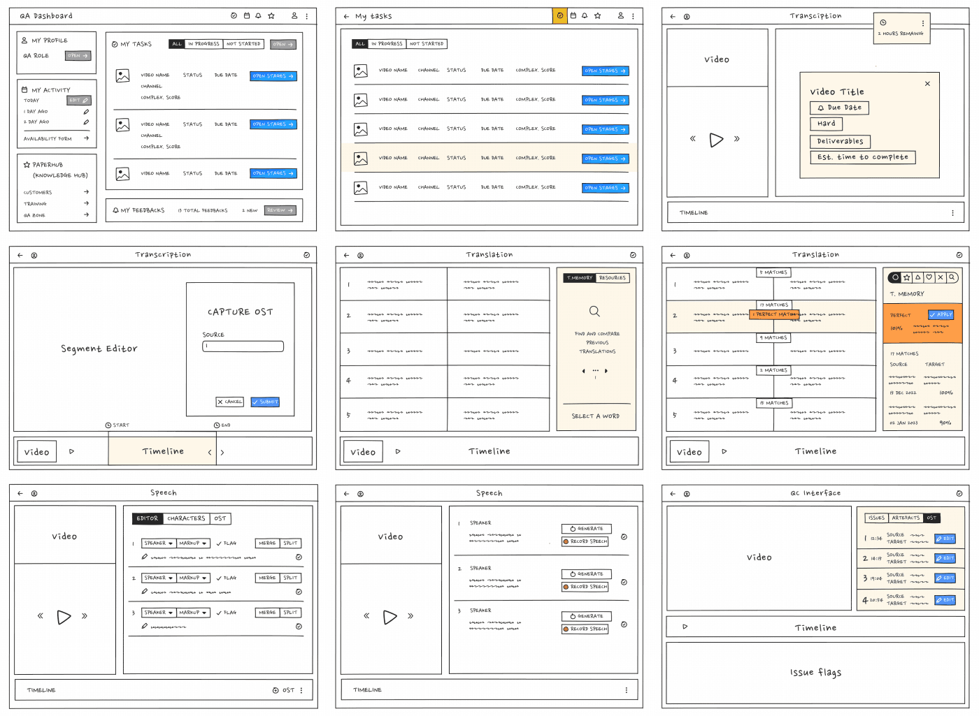
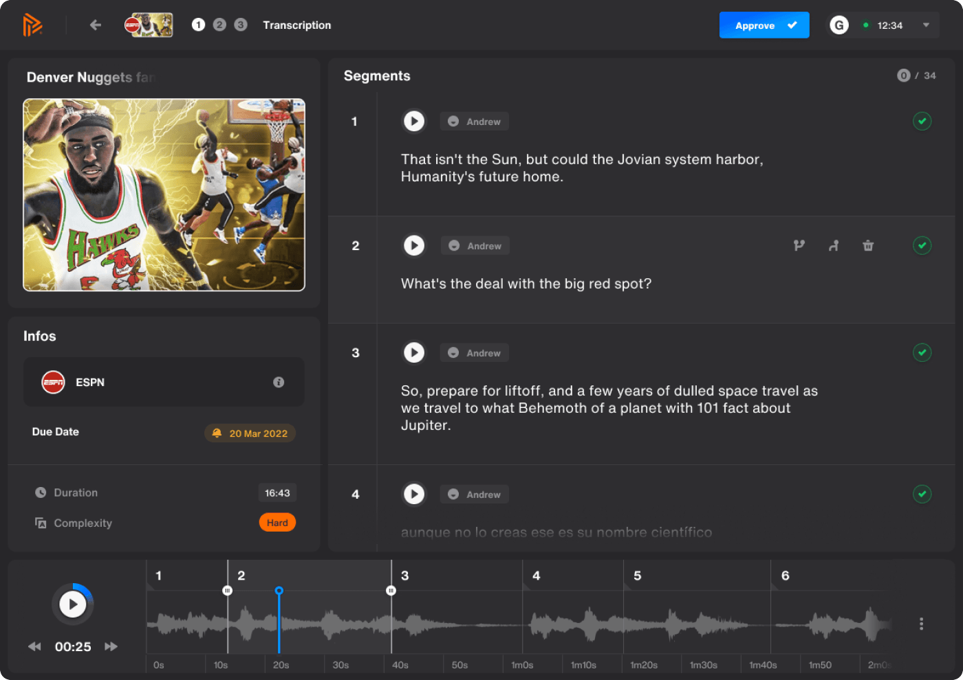
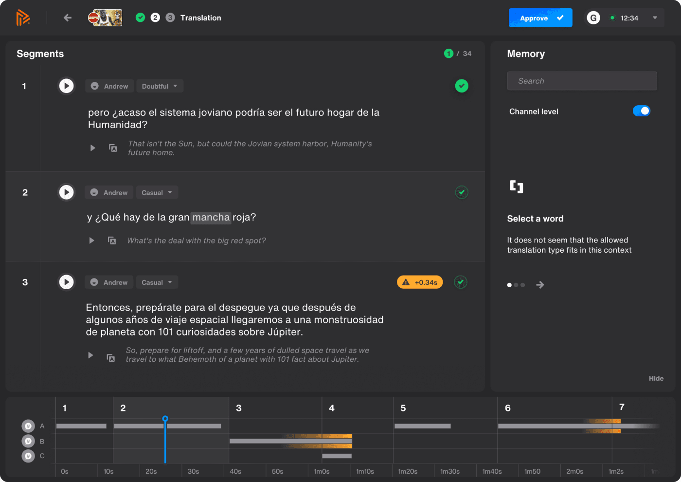
I identified the levers that would make the new workflow something QAs actually wanted, not just tolerated, running structured workshops to map goals, key metrics, and objectives across both stakeholder groups, QAs and managers, working collaboratively with the product team on roadmap fit while the design direction and final calls stayed mine. 2 main goals came directly out of those workshops:
- •Speed, cutting the ratio of QA minutes spent per minute of video, down from the 3:1 baseline that had become my obsession
- •Quality, flagged issue rate per video, the average number of categorised issues QC raised per translation, so speed gains couldn't come at the cost of translation accuracy
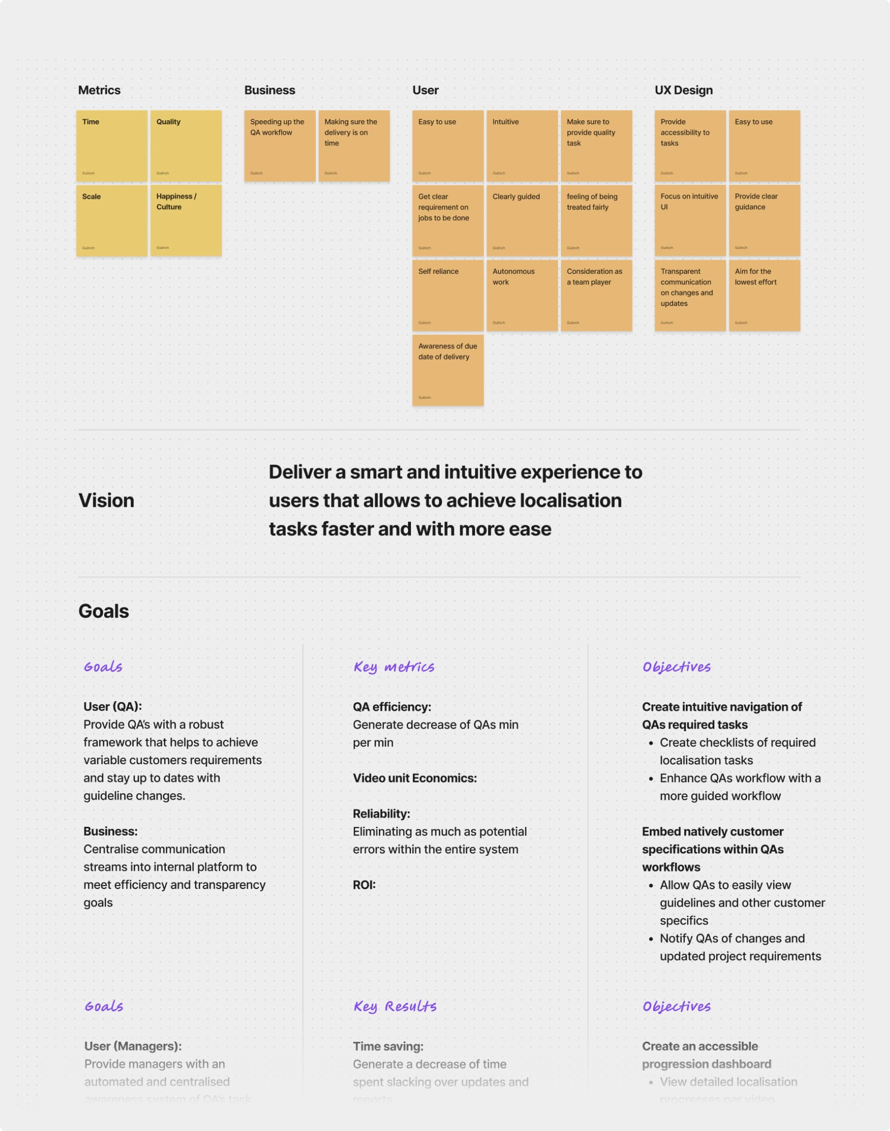
The same sessions also produced the principles that guided the redesign, specific to Papercup, not generic best practice:
- •Optimise every user action to increase processing speed
- •Actions should create structured inputs usable by data science and ML
- •Consistent, reusable patterns for user guidance
- •Translation workflows adjusted per customer specifics
Once the redesigned workflow shipped, I tracked adoption directly through QA surveys. 22 responses came back, translation was flagged as the stage needing the most improvement at 77.3%, and overall experience clustered between neutral and positive rather than a clean sweep, honest proof that a redesign this disruptive doesn't win everyone over instantly, but the direction was right.
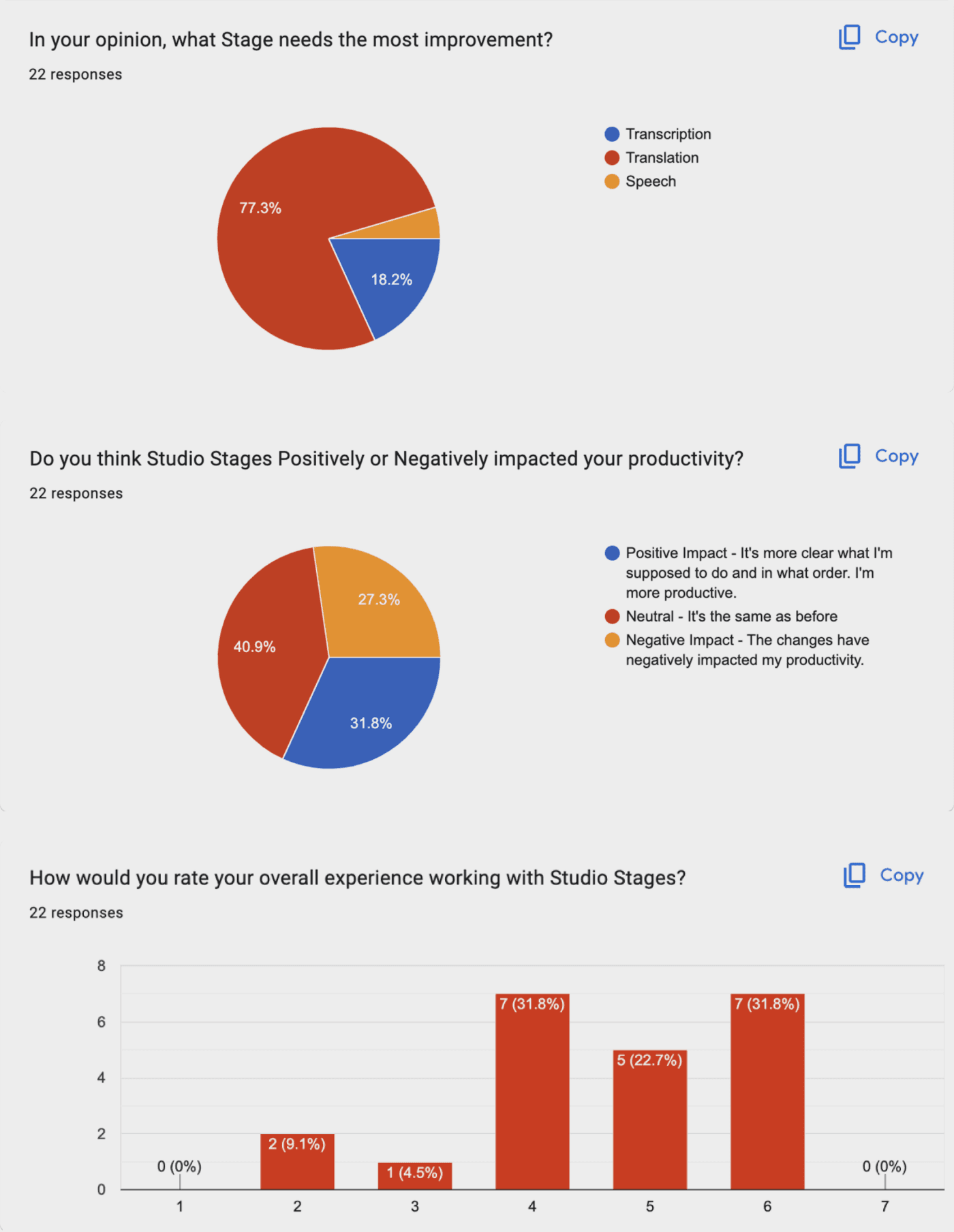
Once the staged workflow I designed shipped to production, QAs became easier to track and issues easier to assess. Each stage was optimised for its core function, with features I designed to let QAs work with more confidence. The redesign I led also made the system scalable for multi language support, notably, the transcript stage now only needed processing once to serve any target language, which wasn't possible in the version I'd originally designed.
Both goals set in the workshops moved:
- •Speed, the ratio went from 3:1 down to close to 1:1, roughly one minute of QA time per minute of video
- •Quality, the flagged issue rate per video held steady rather than climbing, proof the speed gain didn't come at quality's expense
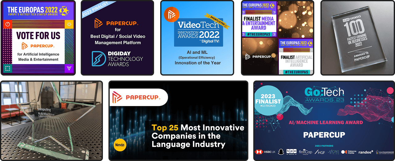
Deals signed with pioneering media industry customers, generating millions of views worldwide and multiple award winning name in AI dubbing.
The hardest part of this long term responsibility wasn't building V1, it was leading past V2. Getting to V1 was research and iteration against a blank page, nothing to unlearn yet. Leading the redesign meant unlearning two years of my own certainty about the user, and learning as a leader that a technically correct decision I'd led could still fail if it broke habits people already trusted. That's the call I had to keep making, not just what's right, but what will actually be adopted.